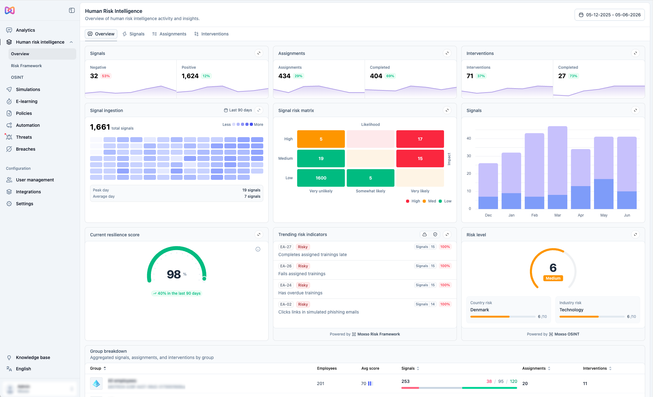
You'll find it under Human risk intelligence > Overview in the left navigation.
Section 1: Signals, Assignments, and Interventions
The top section shows three counters side by side: Signals, Assignments, and Interventions. Each shows a total count for the selected time period and a trend line so you can see how activity is changing over time.
Signals are the individual events Moxso tracks to build a risk picture for each employee. They come in three types: negative (for example, an employee clicks a link in a phishing simulation), neutral (for example, an employee receives a phishing simulation), and positive (for example, an employee uses the report button to flag a suspicious email).
Assignments covers the videos and courses assigned to employees, both completed and pending.
Interventions covers escalation-level actions taken in response to risky behavior, for example notifying a manager about an employee whose risk pattern requires a conversation.
A rise in negative signals is worth investigating. It may reflect a specific group underperforming, a new phishing campaign targeting your industry, or a gap in your training coverage. A drop in assignments may mean automated flows have stalled. Use the trend lines as an early indicator of changes that need your attention.

Section 2: Signal detail
This section breaks down signals in three ways.
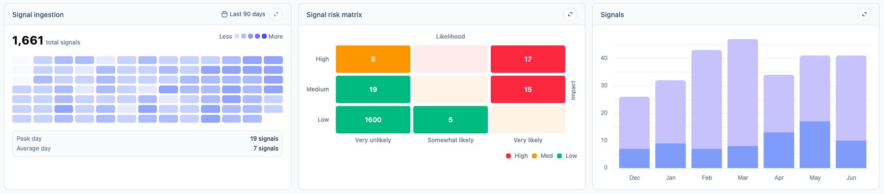
The Signal ingestion panel shows all signals captured over the past 90 days, distributed across a calendar heat map. Darker cells represent days with more signal activity. Use this view to identify days or weeks where signal volume spikes or drops, and cross-reference them with what was happening in your organization at the time.
The Signal risk matrix plots your signals against two axes: likelihood (how probable this type of behavior is) and impact (how much it affects your risk calculation). Each signal is categorized by color: high, medium, or low. The red boxes represent signals that are both high impact and high likelihood. These are the signals that most directly affect your overall risk level and are worth prioritizing.
The Signals over time bar chart shows how signal volume is changing month by month.
Low signal volume across the board can indicate that employees are not being tested often enough, or that reporting behavior is low.
Section 3: Risk
This section translates collected signals into a risk picture for your organization.
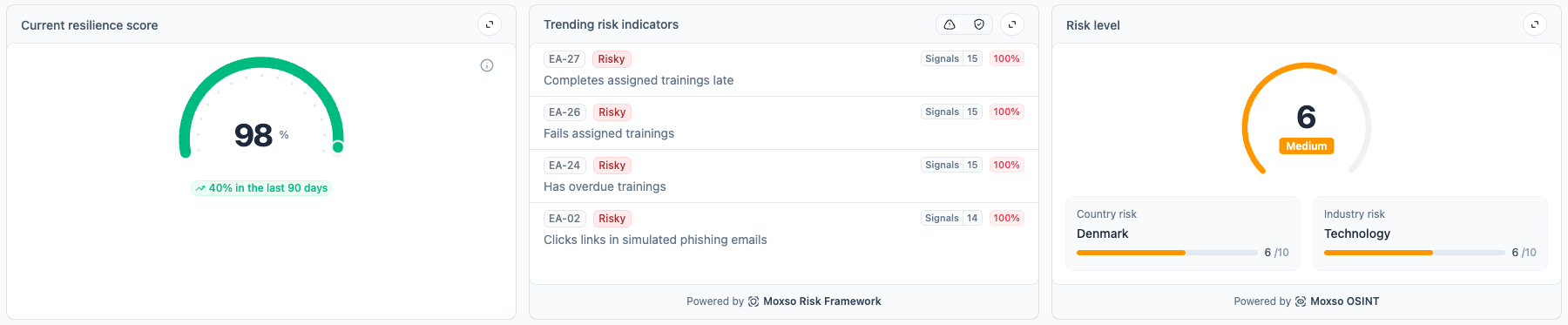
The Current resilience score shows the organization's overall score and the percentage change over the past 90 days.
The Trending risk indicators panel shows the risk indicators that are currently generating the most signals across your employee population, compiled from the Moxso Risk Framework. Each indicator shows how many signals are contributing to it. Think of this as a prioritized list of the behaviors your program should address right now.
The Risk level panel shows your organization's current risk score on a scale of 1 to 10, with a breakdown by country risk and industry risk. Both are powered by Moxso OSINT, which monitors active threats targeting organizations in your region and sector. You can expand this panel to access a live intelligence feed with more detail on the external context behind your score.
The resilience score tells you where you are. The trending risk indicators tell you what internal behaviors are driving it. The risk level panel tells you what is happening externally. Together, these three give you the context to prioritize.
Section 4: Group breakdown
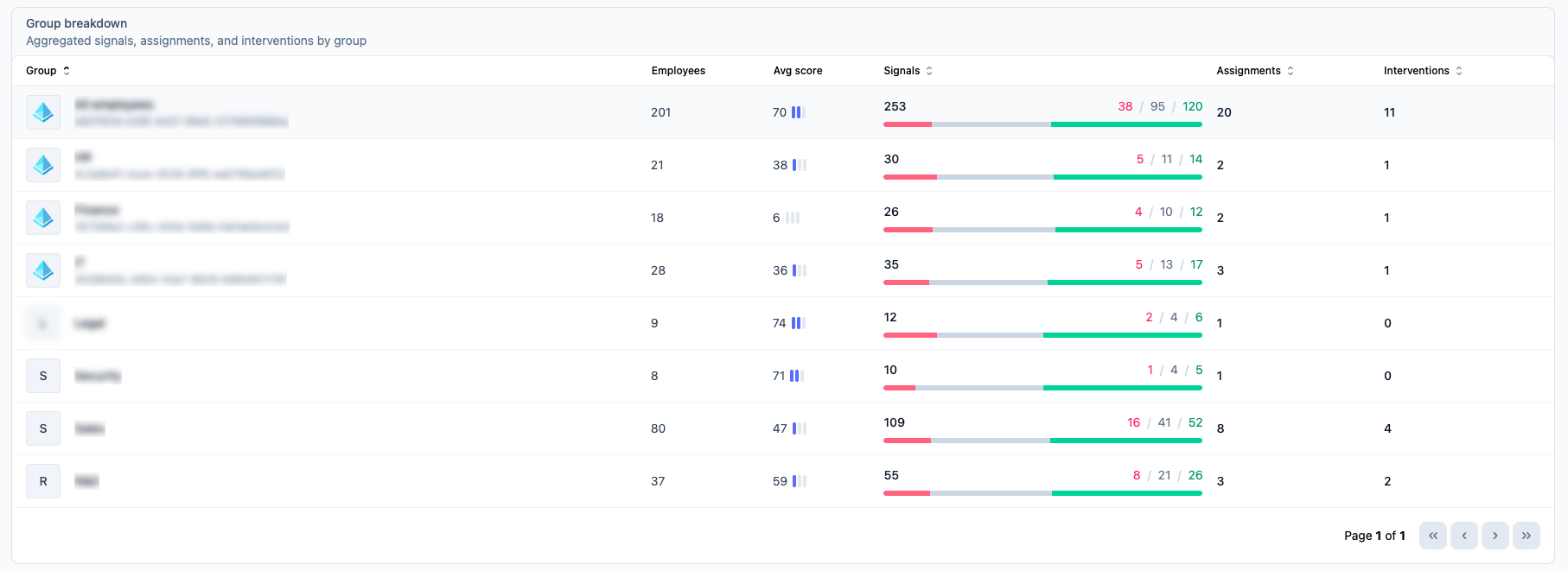
The bottom section breaks down all the data above by employee group. For each group, you can see the number of employees, their average resilience score, the number of signals generated (split by negative, neutral, and positive), the number of assignments, and the number of interventions. You can sort by any column.
Your overall resilience score can look healthy while a specific group has a significantly lower score. The group breakdown lets you identify those groups and track whether interventions targeted at them are having an effect over time.